
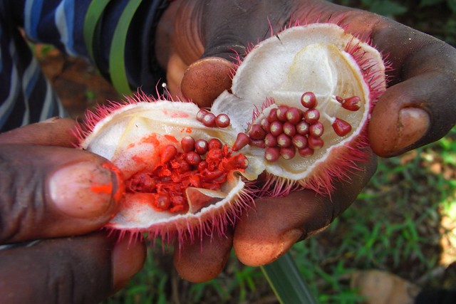
The second photo is simply titled lipstick plant, so I assume that those berries (seeds?) can be used to color one's lips. You know what else you can use? Schmancy lipsticks from various brands! Wow, I am so good at transitions. Anyway, I'll admit that I was pretty liberal with my definition of "lipstick tube"...

Is it in bad taste to start with one that I disapprove of? This is "Edward's Best 8-Color Lip Palette", which astounds me because it's so obvious that it's not a picture of the actual product. I cannot imagine why you would think it was a good idea to show Photoshop gradients instead of, y'know, real lip pigments. Here's what it truly looks like (thanks to Best Things in Beauty):


These are also not strictly packaging. What's cool is the sculptural aspect of the lipsticks themselves! Hourglass "Femme Rouge Velvet Crème Lipstick" and Clé de Peau Beauté "Extra Rich" refill.
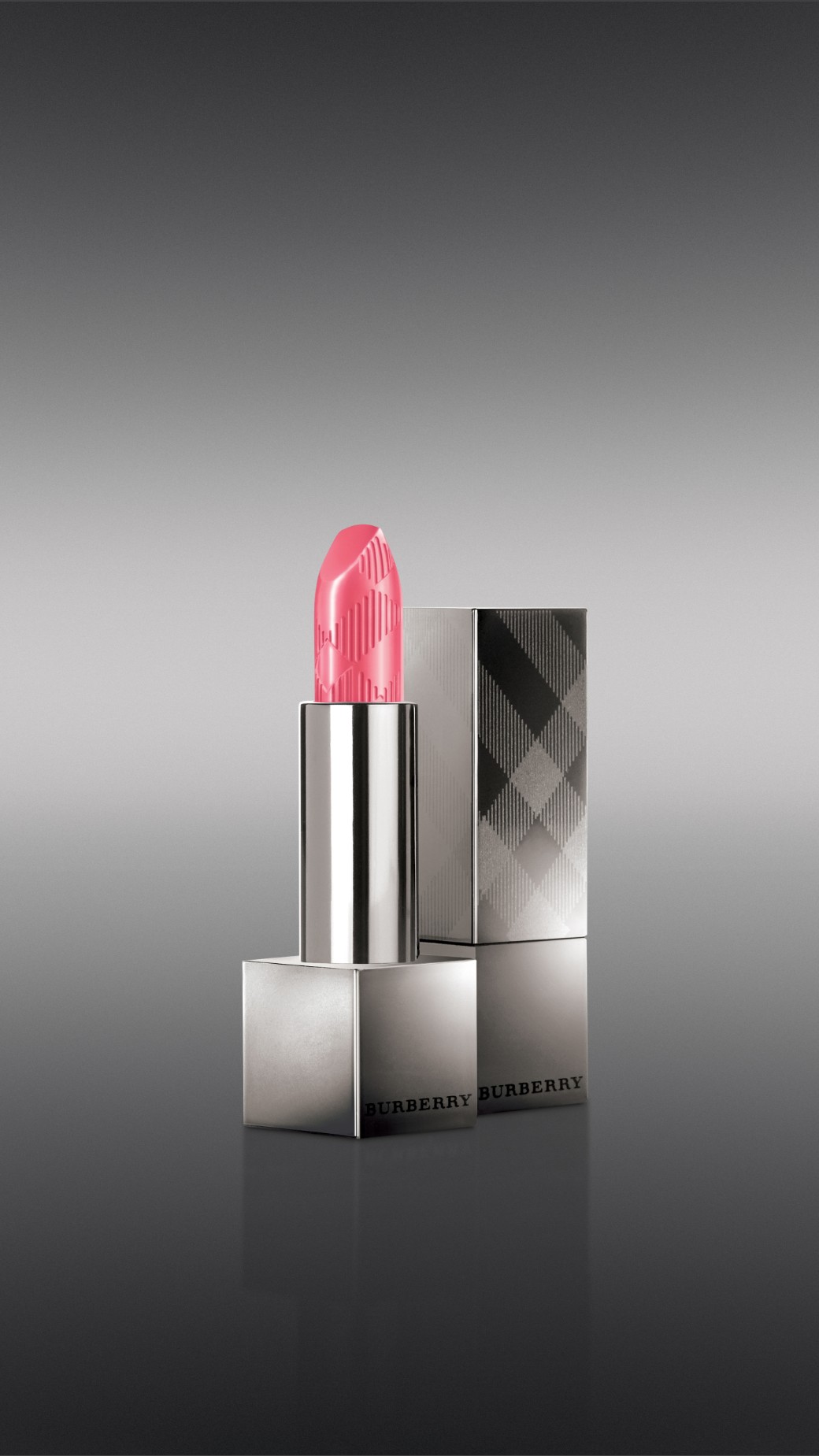
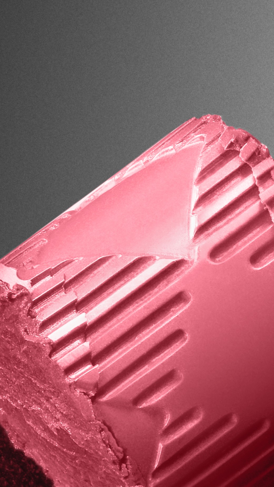
Burberry "Lip Mist", a name that sounds like perfume for your mouth, which I don't necessarily object to. I love pictures of lipstick chunks.


Smashbox rings and Guerlain "KissKiss" lipstick. Speaking of Guerlain...

What is even happening? The package design of "Rouge G de L'Extrait" strongly reminds me of Charlize Theron in Prometheus:


Classy. Cold. Confusing. Paintings by xiaoli and doiron12, both from deviantART. Prometheus is a lovably terrible movie, by the way. Kinda like Avatar: gorgeous sci-fi visuals, but all of the characters are idiots.


Lancôme "L'Absolu Rouge Lipcolor", because it's wearing a hat. Tory Burch "Pas Du Tout Lip Color" because tangerine enamel!!! Lastly, Benefit "Candy-Orchid Lollitint" because it's the cutest thing you ever did see:

Just kidding; the cutest thing you ever did see is obviously Lupita Nyong'o!

File under "fairy princess inspo"...

Love the Cle de Peau bullet - looks like a jewel, so, rogue approved. Not sure it's be the easiest to apply though...
ReplyDeleteIt will always mystify me why companies that have (ostensibly) a perfectly nice looking product will choose to use a hideous, obviously photoshopped picture instead. The promo pics for MAC's upcoming 3D glitters are an excellent example of this, although I'm still holding out hope that the dots are just an unfortunate part of the packaging design...
Seriously. Just... WHY?
DeleteYou need to take a look at the brand Paul and Joe. I lust for their cat lipsticks. Can't afford them, but lust just the same. Sculptural lipsticks are always pretty to look at, but tbh it's not a selling point for me. Within a few uses all that design work will be smeared away. Function over form.
ReplyDeleteI just looked it up. SO CUTE. I agree with you, though. Pretty to look at, but not so practical. Same goes for imprints on eyeshadow, etc.
Delete